A landing page is a single page that has just one goal. It doesn’t matter what goal you choose, such as getting a visitor to make a purchase or sign up to an email list, just stick to one goal per page.
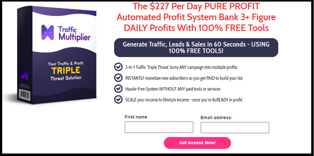
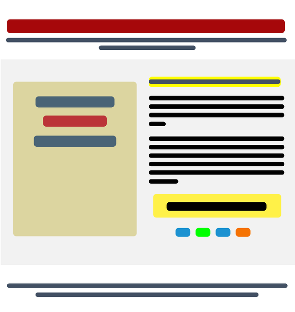
The page construction is simple: it includes an attention grabbing headline telling the visitor what they receive if they signup, a few lines of text explaining the benefits of of that item, some bullet points which are optional and an optin form.

The simple style is deliberate, if you give people too many options they often get confused and don’t do anything.
When they click on the optin form they will be added to the list you’ve created in your autoresponder and they will start receiving emails from you.
WHY YOU NEED A LANDING PAGE
The simple truth is that no matter how you drive traffic to your site, free or paid, you want to leverage every single visitor as much as possible.
Unfortunately, most of the people who come to your website won’t make a purchase the first time they visit, it takes multiple contacts with you and your product or service before they buy.
But, since most of the people who come to your site also won’t ever come back, you’ve lost that person for good…unless you have a landing page with an optin form so they can sign up and allow you to send them emails!
LANDING PAGE DO’S
Follow these guidelines to get the most out of all your landing page:
- Stay congruent. The landing page should offer whatever product or service you had in your ad. For example, if your ad talks about whiter teeth, don’t create a landing page that offers a course on tightening your abs! Also, keep the style consistent from ad to landing page. Use the same images, colors and text styles.
- Be bold, let people know what you want them to do. This is your call to action, CTA. Make sure the “Click here” button is large and above the fold of your page (that means they don’t have to scroll to get to the button)
- K.I.S.S. Keep your landing page short and sweet. Get to the point quickly. Bullet points are a great way to do that.
As with most things online, a landing page is simple in concept but may take a few tries to hone in on what does and doesn’t work in your market.
When I create my landing pages, like the one above, I include a picture of my product. Some people include short explainer videos and some people don’t include any graphics at all.
You’ll have to experiment to find the best landing page design for your niche and your visitors. Just keep tweaking until you’ve got a winner and then keep using it to build your list!
- Welcome — I’m Marie Grove - March 16, 2026
- Simple 3 Step Formula To Create Affiliate Marketing Emails That Sell - September 24, 2025
- The AI Tools I Used To Go From Overwhelmed to More Profitable – In Less Than 30 Days - September 4, 2025

